Dashboard is available in Evidently OSS, Evidently Cloud and Evidently Enterprise.
What is a Dashboard?
A Dashboard provides a clear view of your AI application performance. You can use it:- to track evaluation results across multiple experiments;
- to track live production quality over time.
Dashboard Tabs
Multiple Tabs are available in Evidently Cloud and Evidently Enterprise.
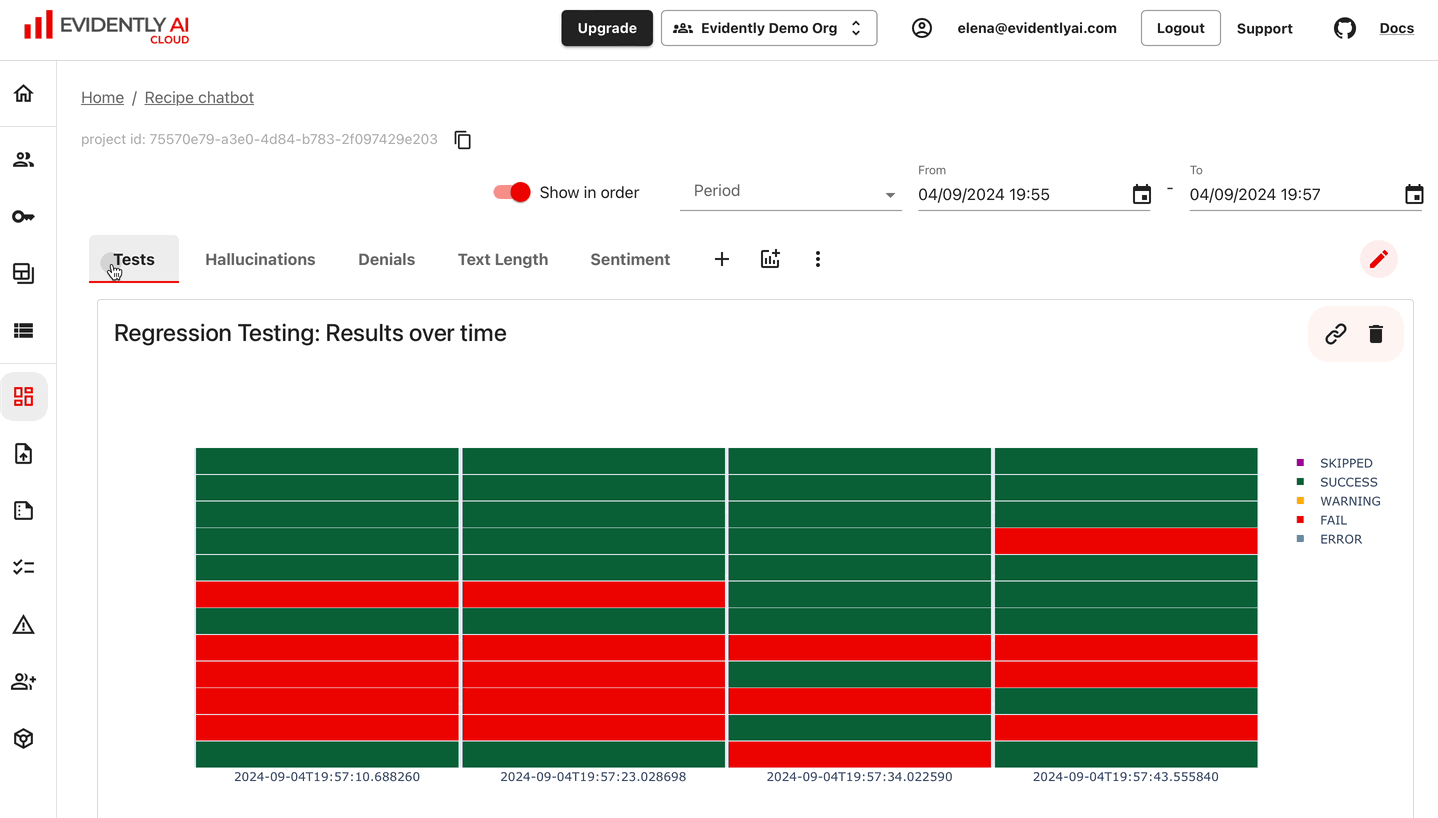
Dashboard Panels
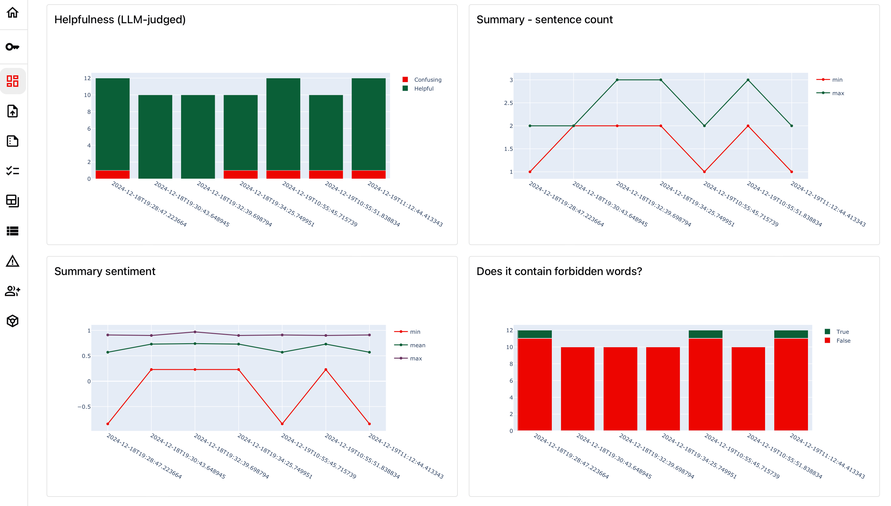
A Panel is a visual element in the Dashboard that displays specified values in a single widget. Panels can be counters, line plots, bar plots, etc. You can add multiple Panels to the Dashboard and customize their type and values shown. You can add Panels in two ways:- Using the Python API – define your Dashboard as code.
- Through the UI – add Panels directly from the interface (Cloud and Enterprise only).
- Value – choose an individual metric to plot.
- Parameters – such as title, panel type, and size.
- Tags (optional) – use to filter and visualize subsets of your data.
From Dashboard to Reports
By clicking on any individual value on the Dashboard, you can open the associated Report and source Dataset for further debugging.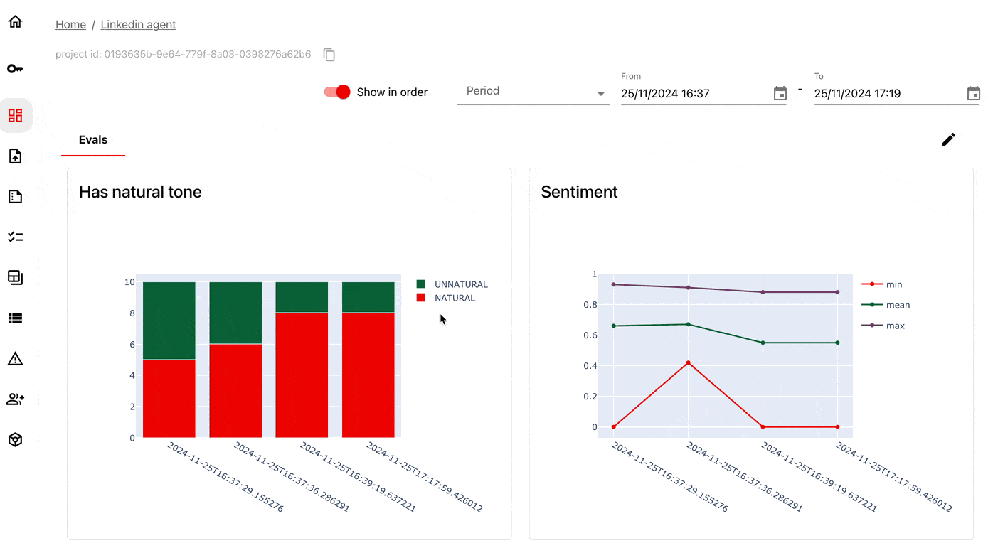
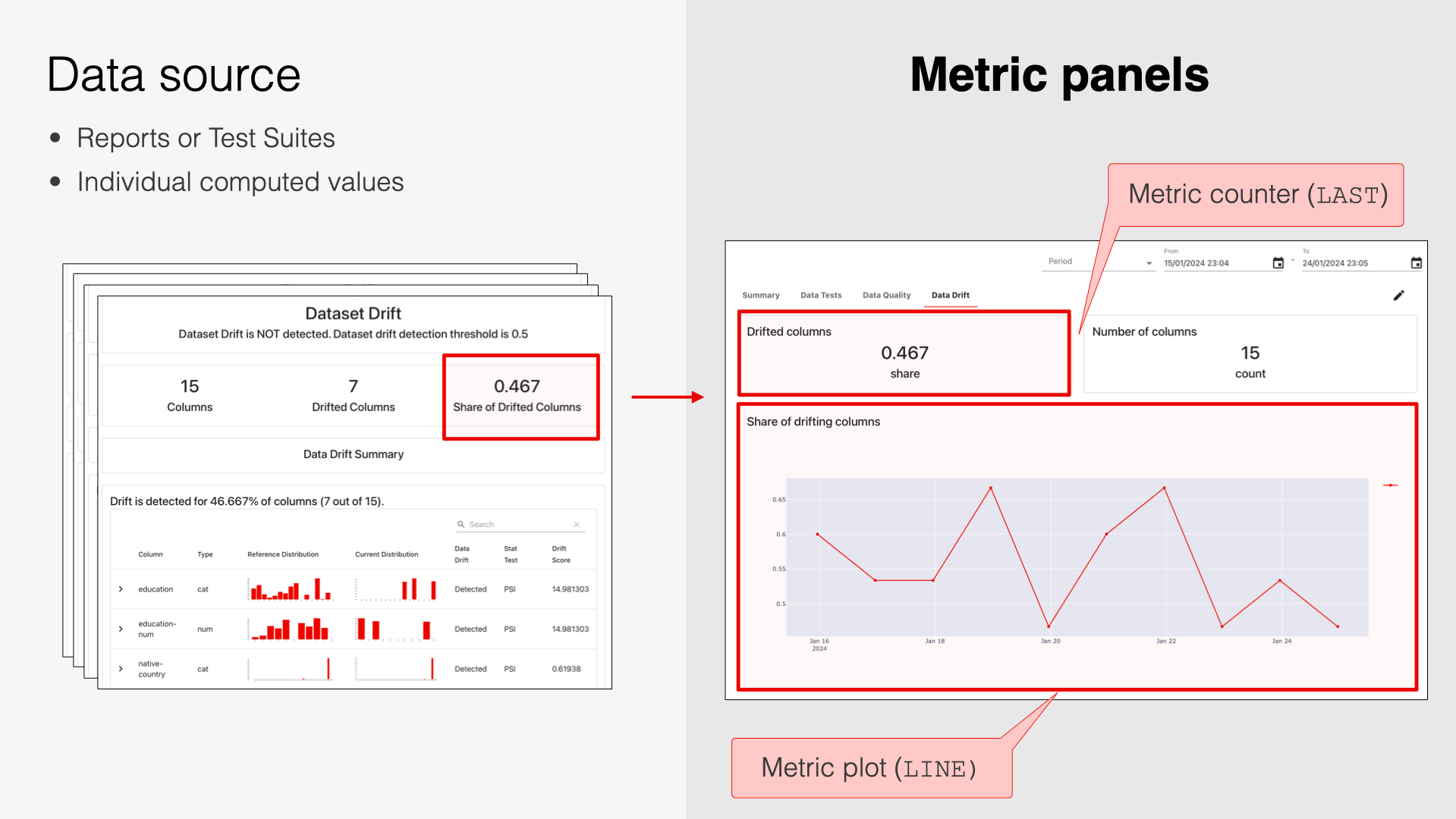
Data source
Dashboards rely on having Reports in the Project as a data source. When adding a Panel, you select a Metric, and Evidently pulls the corresponding value(s) from all Reports in the Project to plot them. For example, if you log multiple Data Drift Reports (each includes theDriftedColumnsCount for the corresponding batch), you can plot how this Metric value changes over time.
What’s next?
- See how to customize dashboard via API.
- See how to customize dashboard via UI.