Dashboard Management
Dashboards as code are available in Evidently OSS, Cloud, Enterprise.
Adding Panels
Imports:Text
Text-only panels are perfect for titles. Add a text panel. Add a new text panel to the specified Tab.Counters
Counter panels show a value with optional supporting text.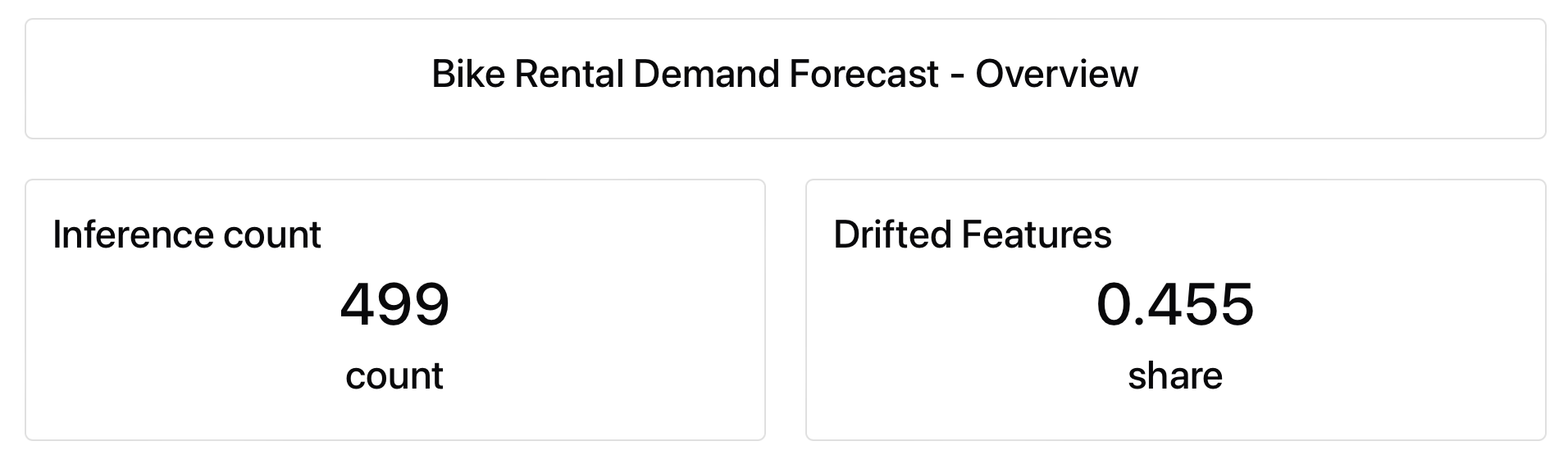
Text counter
Shows the specified value(s) and optional text.
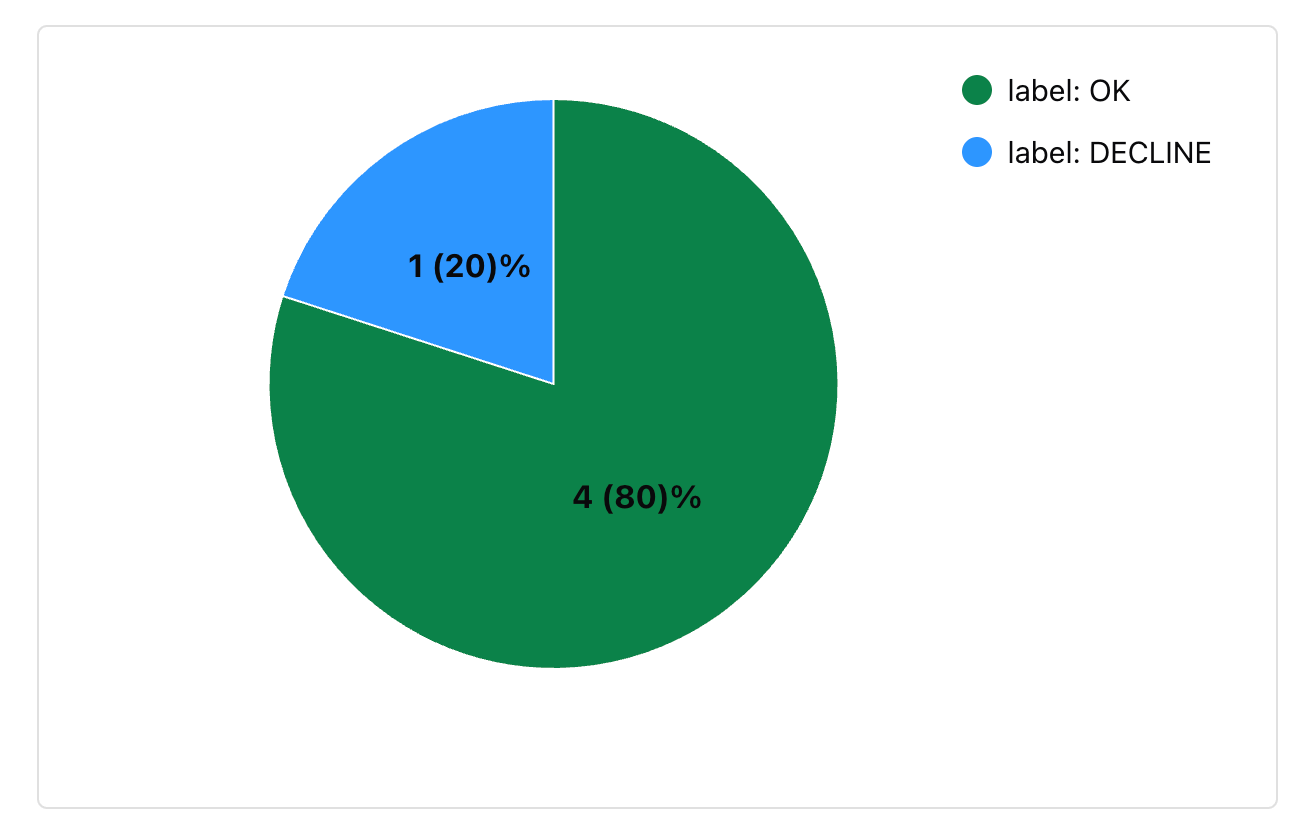
Pie chart
Shows the specified value(s) in a pie chart.
RowCount metric with different aggregations:
sum, last, avg).
Plots
These Panels display values as bar or line plots.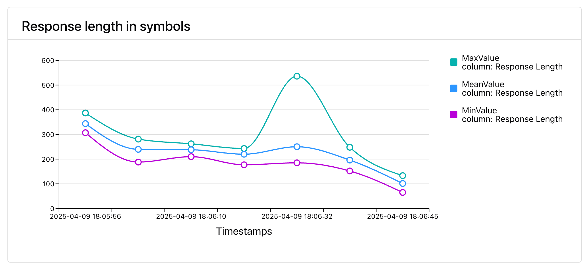
Line chart
Shows the selected values over time. You can add multiple series to the same chart as multiple lines.
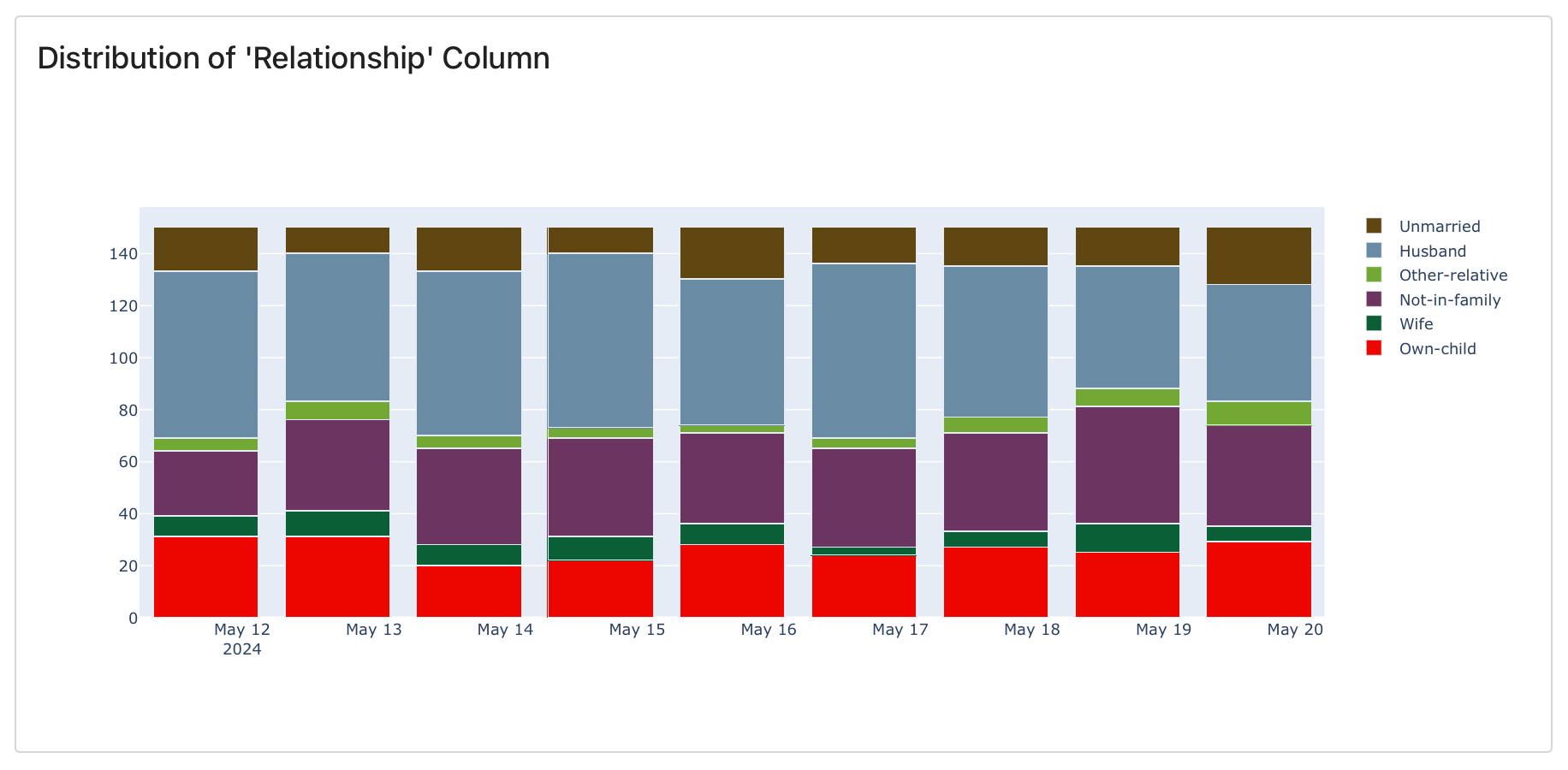
Bar chart (stacked)
Shows selected values or distributions over time (if stored in each Report). Stacked in a single bar.
Bar chart (grouped)
Shows selected values or distributions over time (if stored in each Report). Multiple bars.
RowCount metric.
Dashboard Panel options
A summary of all parameters:Configuring Panel values
Metric
To define which value the Panel displays, you must reference the name of the corresponding Evidently Metric. This metric must be present in the Reports logged to your Project. If the metric isn’t present, the Panel will appear empty. Dataset-level Metrics: pass the Metric name directly toPanelMetric, e.g., "RowCount".
Example:
TextEvals, ClassificationPreset, DataDriftPreset) contain multiple sub-metrics. When logging Reports using a Preset, you must reference the specific metric inside it, such as Accuracy, Recall, etc.
Need help finding metric names? See the All Metrics Reference Table for a full list of Metrics.
Metric labels
Some Metrics require additional context. This applies when the metrics:- Operate at the column level
- Return multiple values (metric results)
- Have user-defined custom parameters
metric_labels to specify what exactly you want to plot.
Example. To plot the share of categories inside “Denials” column:
column label to specify which column or descriptor it refers to.
For example, in a TextEvals Report, each text descriptor (e.g., text length, LLM judged “denials”, etc.) is treated as a column. These descriptors are summarized with various statistics. To plot one of these values, you need to:
- Choose a summary Metric like
UniqueValueCount,MissingValueCount,MaxValue, etc. - Use the
columnlabel to point the specific descriptor.
value. For example, Accuracy returns the corresponding accuracy value. So listing just the Metric name is enough to specify what exactly you want to plot.
However, some metrics produce more than one metric result, like:
CategoryCount: returns bothshareandcountMAE: returns bothmeanandstd
value_type key, e.g. {"value_type": "share"}
How to verify the metric result for a specific metric?
- Look up the expected outputs in the All Metrics Table.
- Or, generate a Report with the target
metricand inspect its structure viareport.dict()orreport.json().
metric_labels.