No-code Dashboards are available in the Evidently Cloud and Enterprise.
Adding Tabs
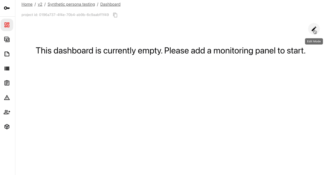
By default, new Panels appear on a single Dashboard. You can add multiple Tabs to organize them. To add a Tab:- Enter “Edit” mode on the Dashboard (top right corner).
- Click the plus sign with “add Tab” on the left.
- To create a custom Tab, select “empty” and enter a name.
| Template | Description | Data source |
|---|---|---|
| Columns | Shows the results of text evaluations over time OR plots column distributions over time for categorical and numerical columns. | TextEvals(), DataSumaryPreset()orValueStats() for individual columns. |
Adding Panels
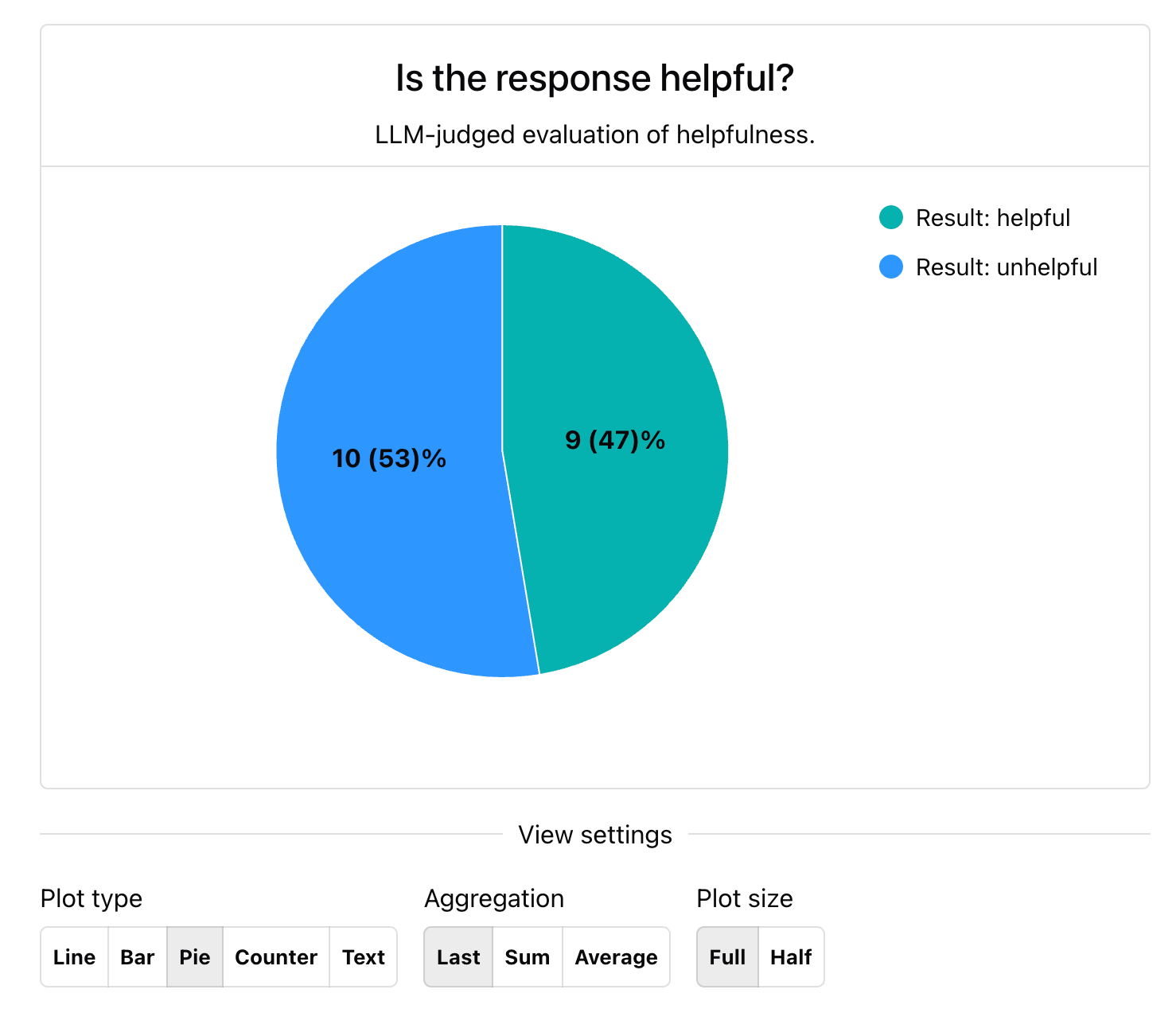
You can add any number of Panels to your Dashboard, including text panels, counters, pie charts, line plots, and bar plots (grouped and stacked). When you create a Panel, you pull the corresponding value from multiple Reports and show it over time or using the specified aggregation (sum, average, last).Check the preview and description of each Panel here: How to add panels via Python API.
- Enter “Edit” mode on the Dashboard (top right corner).
- Click on the “Add Panel” button next to it.
- Follow the prompts to configure the panel.
- Use the preview to review your setup.
- Click “Save” and select the Tab where you want to add the Panel.
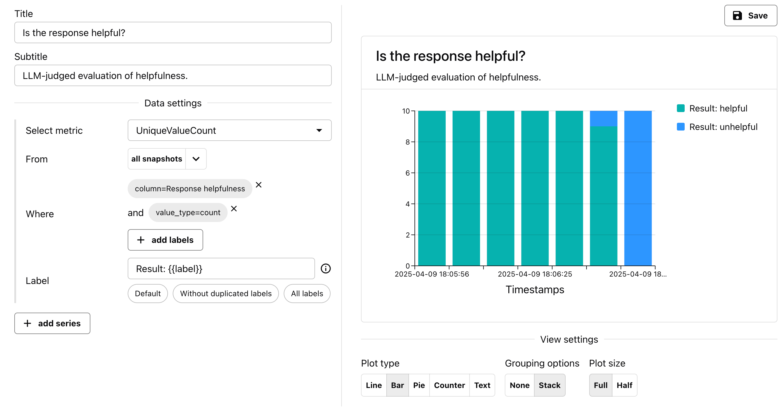
- Select Metrics. To point to a specific Metric, you must choose the Metric name that matches the name of the Evidently Metric logged inside the Reports in the given Project.
- Filter by Tag. By default, the metrics will be parsed from all Reports in the Project. Use the “From” field to filter by Tags. (You must first attach these tags to the corresponding Reports).
-
Filter by Metric label. If you have a single Metric of that type in the Project (like
RowCount), it may be enough to just specify the metric name. However, if you have multiple instances of the same metric - as is often the case for column-level Metrics likeUniqueValueCount- you need to specify additional parameters. Use the “Where” selector to specify further keys like:- Column: Use this to select the name of the column or descriptor.
- Value type: Choose whether to plot value or count for metrics that return both.
- Set Legend. You can use the “Label” field to modify what appears on the legend.
- Set Panel Type. You can also specify the plot type and aggregation level.