What is a monitoring Panel?
A monitoring Panel is an individual plot or counter on the Monitoring Dashboard.- You can add multiple Panels and organize them by Tabs. You can customize Panel type, values shown, titles and legends.
- When adding a Panel, you choose a Test or Metric with the specific value (“metric result”) inside it. Evidently pulls corresponding value(s) from all Reports in the Project and plots them on the Panel.
- You can use Tags to filter data from specific Reports. For example, you can plot the accuracy of Model A and Model B next to each other. To achieve this, add relevant Tags to the Report.
How to add Panels. This page explains the Panel types. Check the next section on adding Panels.
- Metric panels plot individual values from inside Reports.
- Test panels show pass/fail Test outcomes in time.
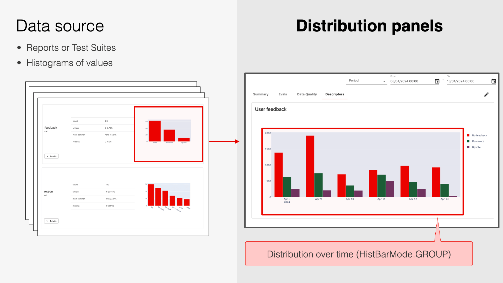
- Distribution panels plot distributions over time.
Metric Panels
Metric Panels (DashboardPanel) show individual values from inside the Reports in time.
For example, if you capture Data Summary Reports (include mean, max, min, etc., for each column) or Data Drift Reports (include the share of drifting columns and per-column drift score), you can plot any of these values in time.
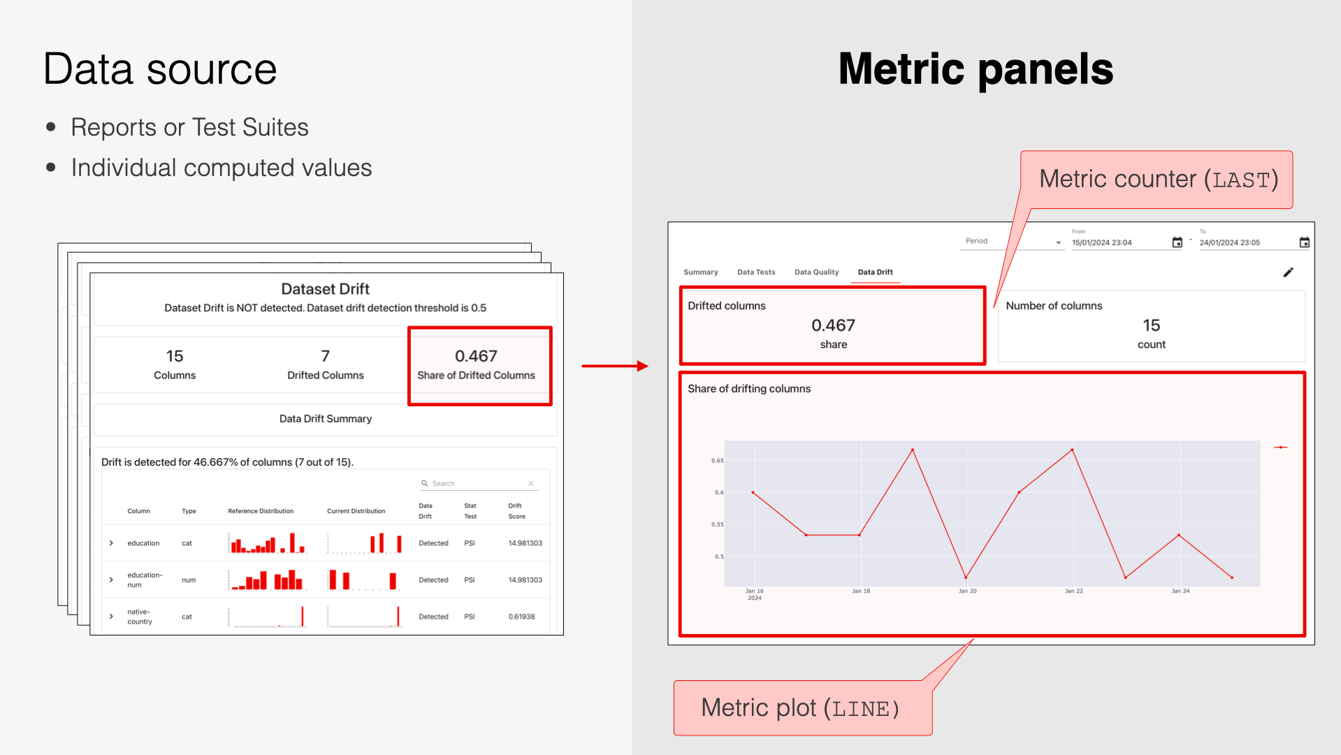
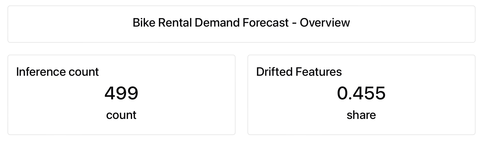
Counter
ClassDashboardPanelCounter.
Shows a value with supporting text or text alone. Perfect for dashboard titles.
Plot
ClassDashboardPanelPlot. Shows individual values as bar, line, scatter plot, or histogram.
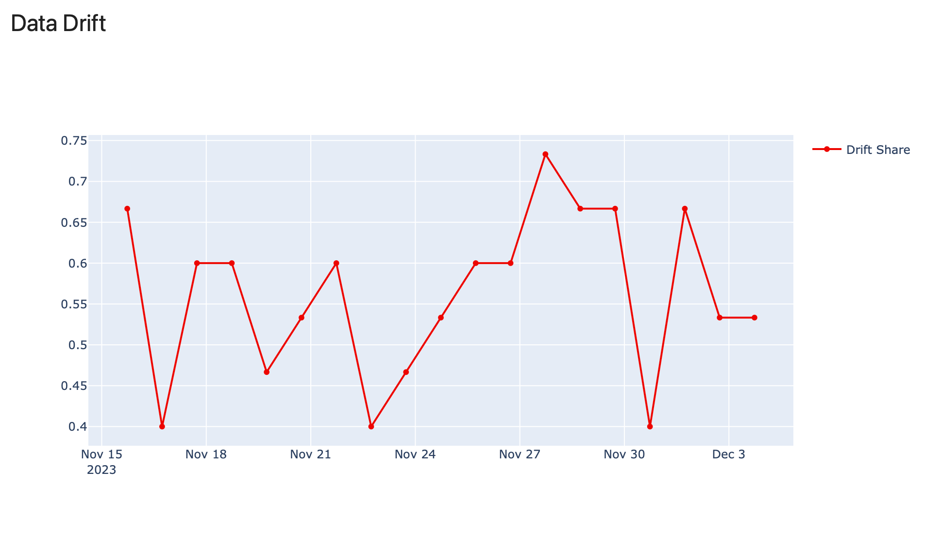
Line chart
PlotType.LINE shows values over time from multiple Reports.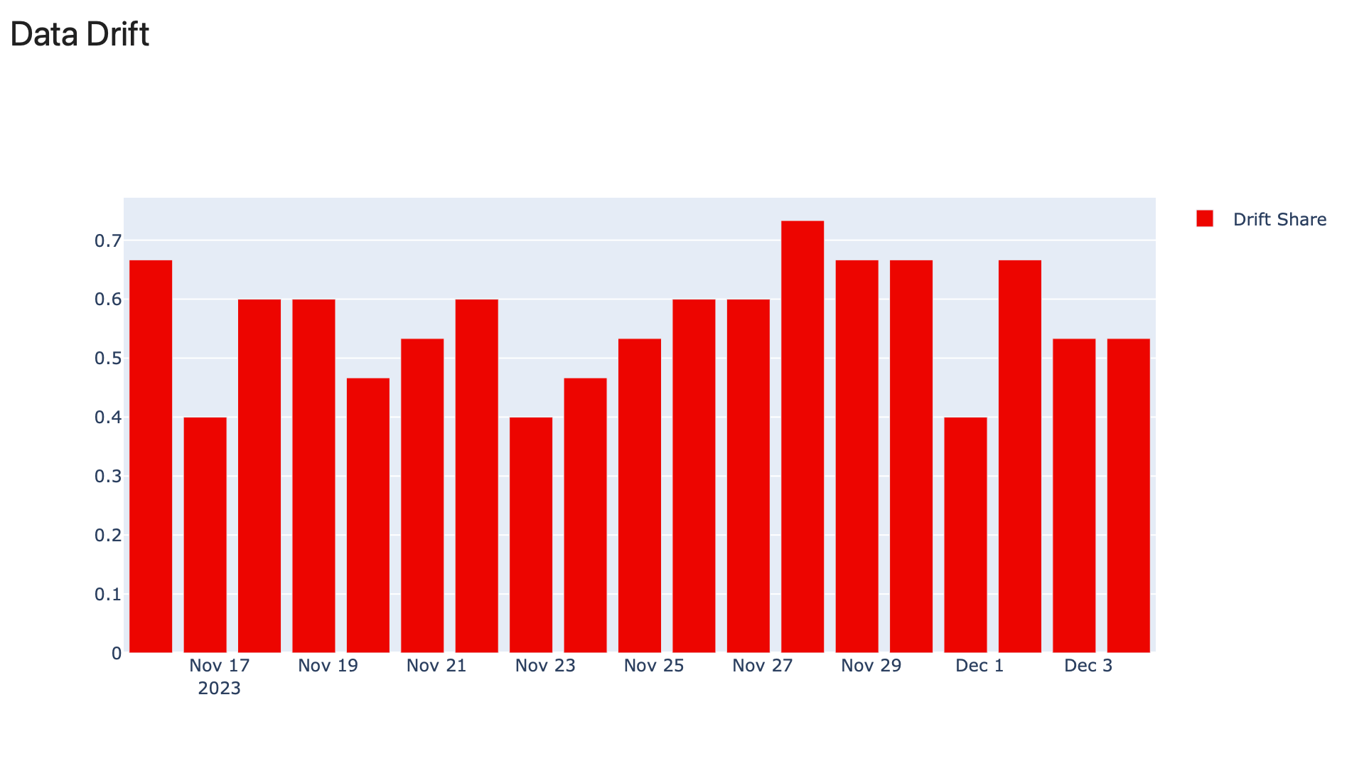
Bar chart
PlotType.BAR shows values over time from multiple Report.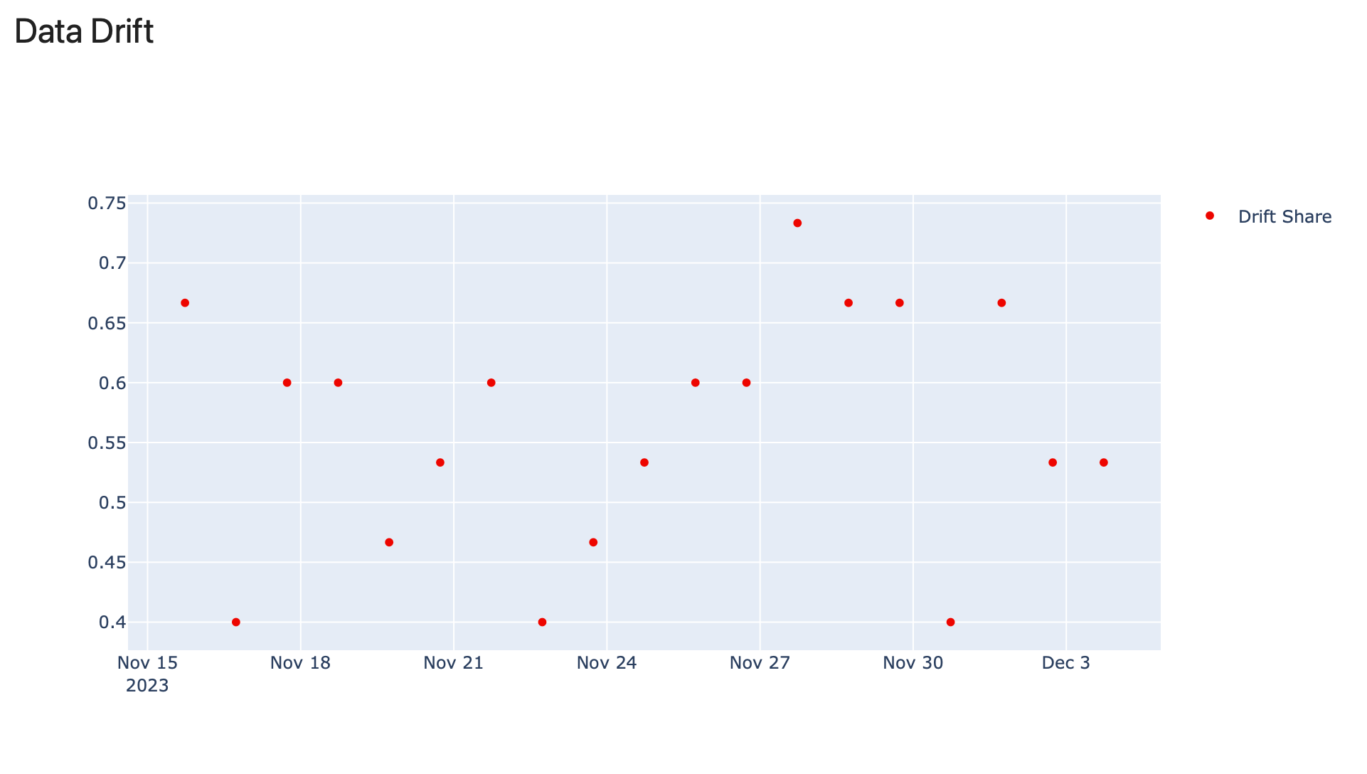
Scatter plot
PlotType.SCATTER shows values over time from multiple Reports.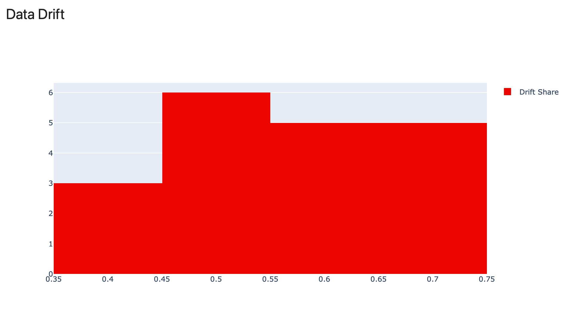
Histogram
PlotType.HISTOGRAM shows the frequency of individual values across Reports.Test Panels
Test Panels show the Test results. As you run the same Tests repeatedly, you can visualize the pass/fail outcomes or result counts. You choose which Test results to include.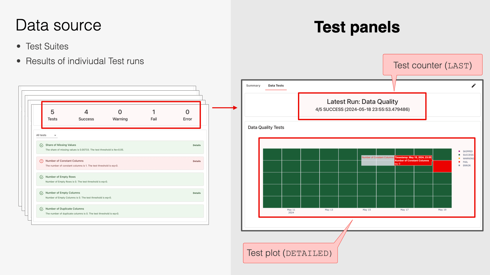
Test counter
ClassDashboardPanelTestSuiteCounter. Shows a counter of Tests with specified status.

Test plot
ClassDashboardPanelTestSuite.
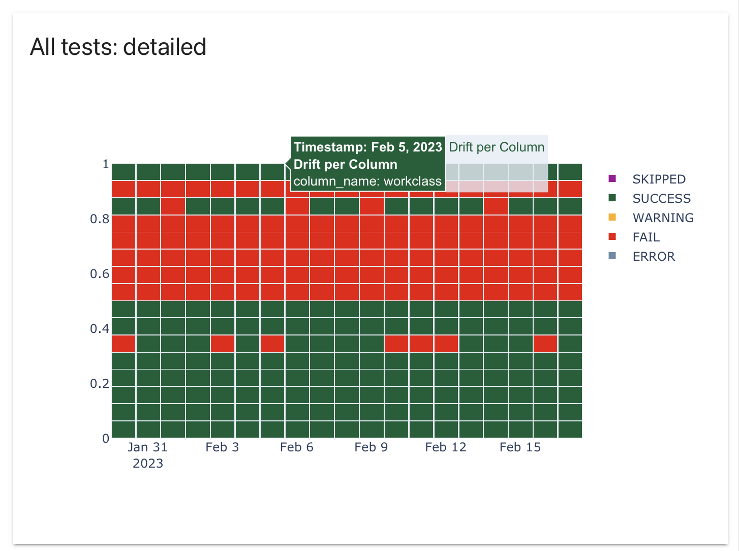
Detailed plot
TestSuitePanelType.DETAILED. Individual Test results are visible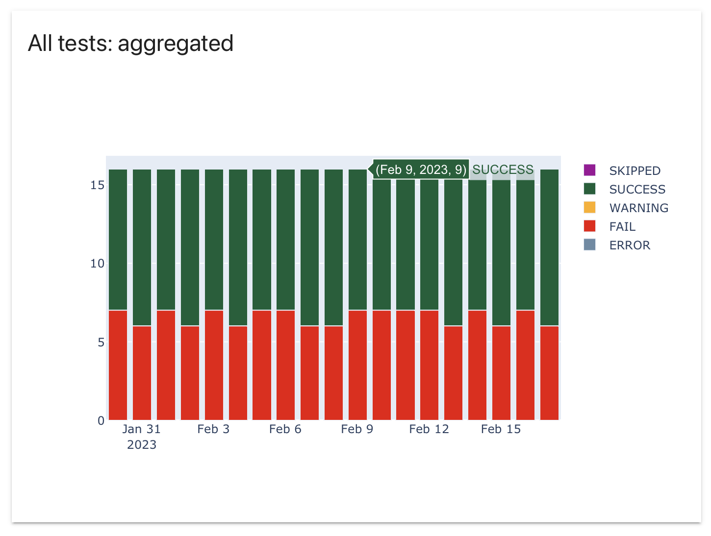
Aggregated plot
TestSuitePanelType.AGGREGATE. Only the total number of Tests by status is visible.Distribution Panel
ClassDashboardPanelDistribution. Shows a distribution of values over time.
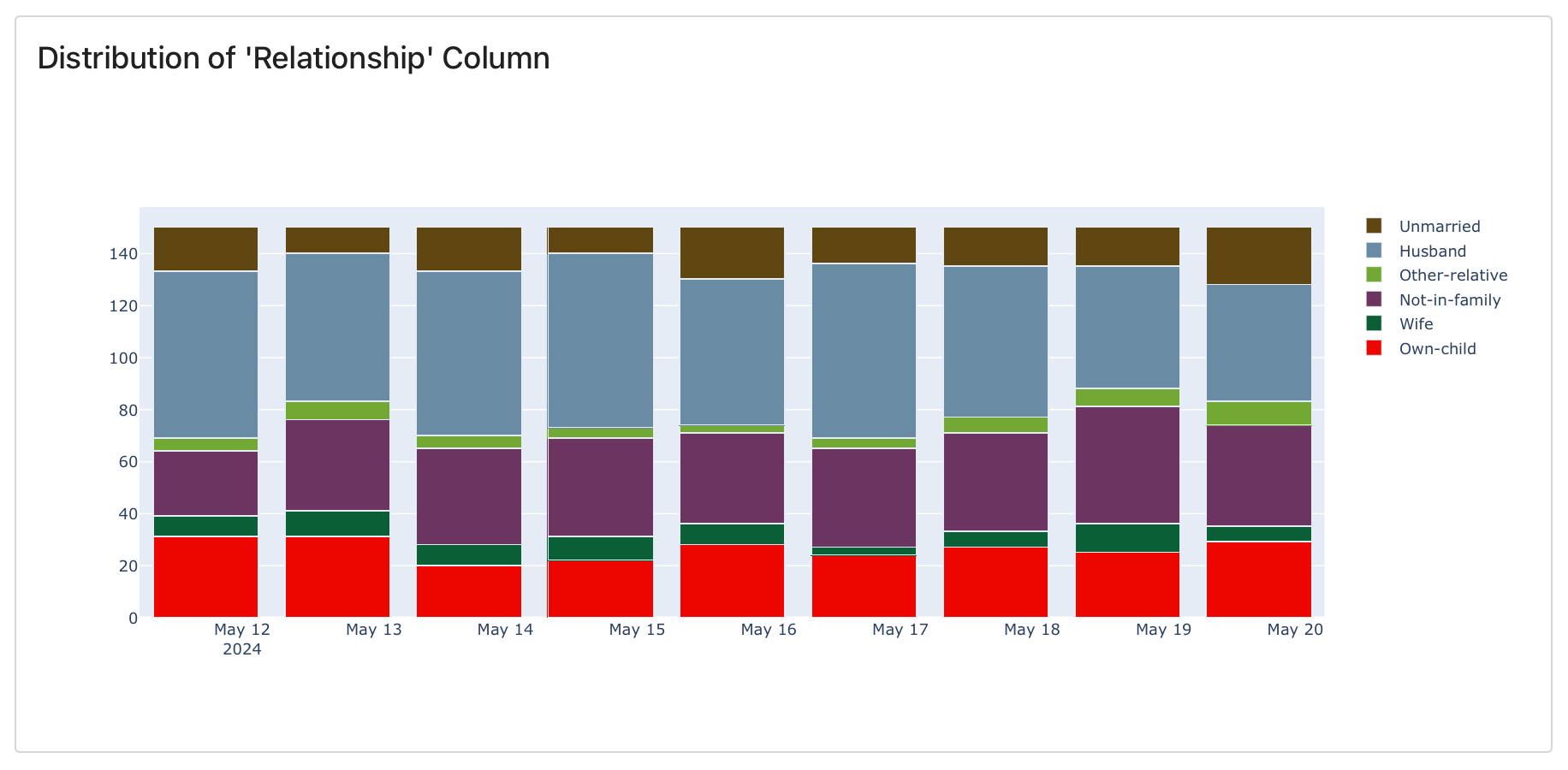
Stacked
barmode="stack": stacked bar chart shows absolute counts in a single bar.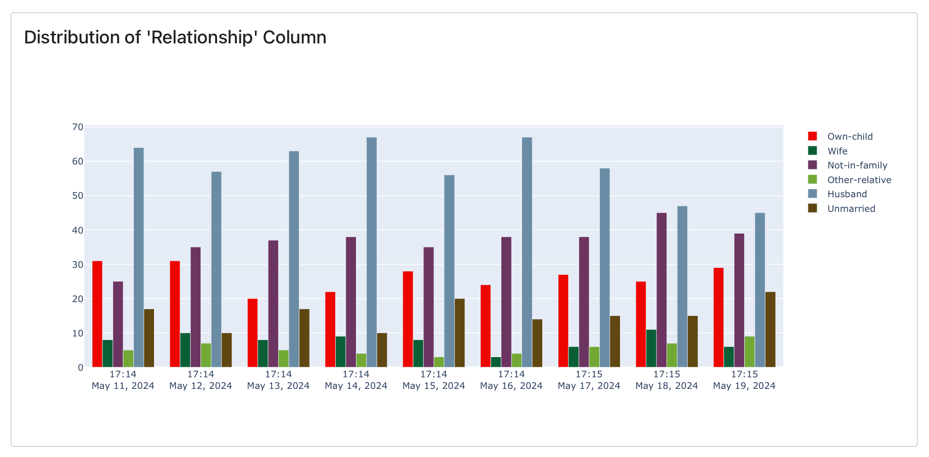
Grouped
barmode="group": grouped bar chart shows absolute counts in separate bars.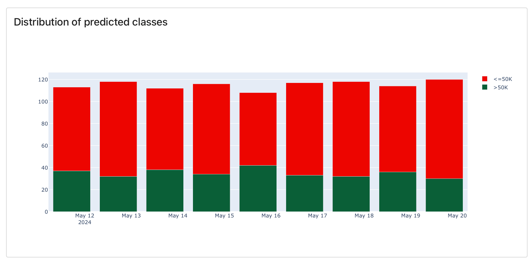
Overlay
barmode="overlay": overlay bar chart shows overlaying absolute counts.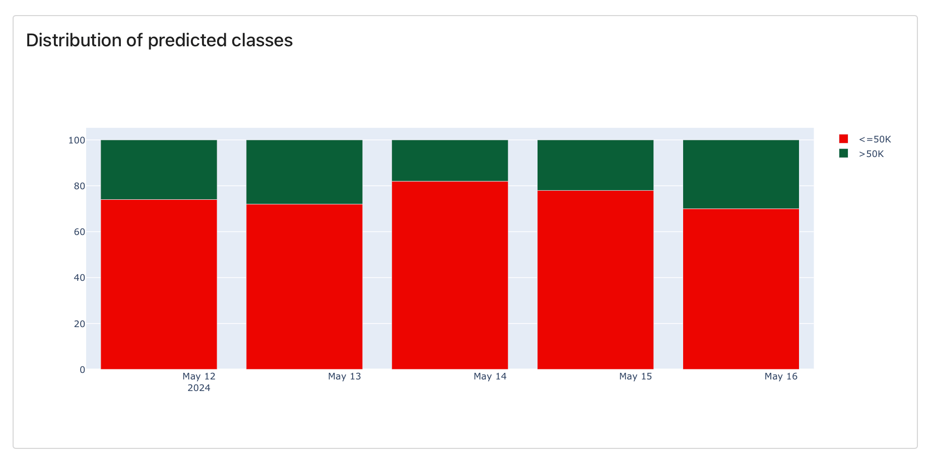
Relative
barmode="relative": relative bar chart shows stacked relative frequency.What is the difference between a Distribution panel and a Histogram? A histogram plot (
DashboardPanelPlot withPlotType.HISTOGRAM) shows the distribution of the selected values from all Reports. Each source Report contains a single value (e.g., a “mean value”). A Distribution Panel (DashboardPanelDistribution) shows how a distribution changes over time. Each source Report contains a histogram (e.g. frequency of different categories).What’s next?
How to add monitoring Panels and Tabs.title: ‘Add dashboard panels’ description: ‘How to design your Dashboard with custom Panels.’
This page shows how to add panels one by one. Check pre-built Tabs for a quick start, and explore available Panel types.Adding Tabs
Multiple Tabs are available in the Evidently Cloud and Enterprise.
create_tab:
add_panel method shown below and specify the destination Tab. If there is no Tab with a set name, you will create both a new Tab and Panel at once. If it already exists, a new Panel will appear below others in this Tab.
Adding Panels
You can add Panels in the user interface or using Python API.User interface
No-code Dashboards are available in the Evidently Cloud and Enterprise.
- Enter the “Edit” mode by clicking on the top right corner of the Dashboard.
- Click on the “Add panel” button.
- Follow the flow to configure dashboard name, type, etc.
- Preview and publish.
Python API
Dashboards as code are available in Evidently OSS, Cloud, Enterprise.
Add a new Panel
Use the You can add multiple Panels at once: they will appear in the listed order.
add_panel method and configure the Panel:- Pick the Panel type: Counter, Plot, Distribution, Test Counter, Test Plot.
- Set applicable Panel parameters. (See below for each type).
- Specify Panel title and size.
- Add optional Tags to filter data. If empty, the Panel will use data from all Reports.
-
Define what the Panel will show (see examples below):
-
Use
valuesto point a specific Metric result, or -
Use
test_filtersto select Tests.
-
Use
- Set if the Panel should appear on specific Tab.
Note: This does not delete the Reports or data; it only deletes the Panel configuration.
Panel Parameters
General parameters
ClassDashboardPanel is a base class. These parameters apply to all Panel types.
| Parameter | Example use | Description |
|---|---|---|
title: str | title="My Panel" | Panel name visible at the header. |
filter: ReportFilter | filter=ReportFilter(metadata_values={}, tag_values=[]) | Filters define a subset of Reports from which to display the data. Tags or metadata values you list must be added when logging Reports. See docs. |
size: WidgetSize | size=WidgetSize.HALF, size=WidgetSize.FULL (default) | Sets the Panel size to half-width or full-sized. |
Counter
DashboardPanelCounter shows a value count or works as a text-only Panel.
- Text Panel
- Value sum
- Last value
Text only panel. To create a Panel with the Dashboard title only:
| Parameter | Description |
|---|---|
value: Optional[PanelValue] | Specifies the value to display. You must point to a named Metric and a specific result inside it ( value or share/count). Check the Panel Value section below for details. If left empty, displays a text-only panel. |
text: Optional[str] | Supporting text to display. |
agg: CounterAgg | Data aggregation options: SUM: Calculates the value sum. LAST: Shows the last available value. NONE: Reserved for text panels. |
Plot
DashboardPanelPlot shows individual values over time.
Line chart
PlotType.LINE shows values over time from multiple Reports.Bar chart
PlotType.BAR shows values over time from multiple Report.- Single value
- Multiple values
Single value. To plot row count as a LINE plot (you can change to BAR etc.):
| Parameter | Description |
|---|---|
values: List[PanelValue] | Specifies the value(s) to display in the Plot. You must point to a named Metric and a specific result inside it ( value or share/count). Refer to the Panel Value section below for details. You can pass multiple values so that will appear together, e.g., as separate lines on a Line plot, bars on a Bar Chart, or points on a Scatter Plot. |
plot_type: PlotType | Specifies the plot type. Available: SCATTER, BAR, LINE, HISTOGRAM |
Distribution
DashboardPanelDistribution shows changes in the distribution over time. It’s mostly relevant for showing distributions of categorical columns.
Stacked
barmode="stack": stacked bar chart shows absolute counts in a single bar.Grouped
barmode="group": grouped bar chart shows absolute counts in separate bars.| Parameter | Description |
|---|---|
value: PanelValue | Specifies the distribution to display on the Panel. You must point to a named Metric that contains a distribution histogram and set field_path="counts". |
barmode: HistBarMode | Specifies the distribution plot type. Available: stack, group, overlay, relative |
Test Counter
DashboardPanelTestSuiteCounter shows a counter with Test results.
- All Tests (Last result)
- Specific Test (All time)
- Specific Test (Last result)
All Tests. To display the results of the latest Test Suite. Filter by LAST, no filter on Test name.All parameters:
| Parameter | Description |
|---|---|
test_filters: List[TestFilter]=[] | Test filters select specific Test(s). Without a filter, the Panel considers the results of all Tests. |
statuses: List[statuses]Available: TestStatus.ERROR, TestStatus.FAIL, TestStatus.SUCCESS(default), TestStatus.WARNING, TestStatus.SKIPPED | Status filters select Tests with specific outcomes. (E.g., choose the FAIL status to display a counter for failed Tests). Without a filter, the Panel shows Tests SUCCESS. |
agg: CounterAggAvailable: SUM(default), LAST | Data aggregation options:SUM: Calculates the sum of Test results. LAST: Displays the last available Test result. |
Test Plot
DashboardPanelTestSuite shows Test results over time.
Detailed plot
TestSuitePanelType.DETAILED. Individual Test results are visibleAggregated plot
TestSuitePanelType.AGGREGATE. Only the total number of Tests by status is visible.- Detailed (All Tests)
- Detailed (Selected Tests)
- Aggregated (All Tests)
All Tests. Show the results of all Tests in the Project with per-Test granularity.
| Parameter | Description |
|---|---|
test_filters: List[TestFilter] | Test filters select specific Test(s). Without a filter, the Panel shows the results of all Tests. |
statuses: List[statuses]Available: TestStatus.ERROR, TestStatus.FAIL, TestStatus.SUCCESS, TestStatus.WARNING, TestStatus.SKIPPED | Status filters select Tests with specific outcomes. By default the Panel shows all Test statuses. |
panel_type=TestSuitePanelTypeAvailable: TestSuitePanelType.DETAILEDTestSuitePanelType.AGGREGATE | Defines the Panel type. Detailed shows individual Test results where you can hover and see individual results and click to open a corresponding Test Suite. Aggregate (default) shows the total number of Tests by status. |
time_agg: Optional[str] = NoneAvailable: 1H, 1D, 1W, 1M (see period aliases) | Groups all Test results in a period (e.g., 1 DAY). |
Panel Value
Metric ID. To point to the Metric or Test to plot on a Panel, you usetest_filters or metric_args as shown above and pass metric_id or metric_fingerprint . They must include the name of the Metric that was logged to the Project. You must use the same Metic name (with any applicable parameters) that you used when creating the Report.
Working with Presets. You must reference a named Evidently Metric even if you used a Preset. You can check the Metrics included in each Preset here.
field_path. This helps point to a specific result inside the Metric. This can take the following values: value , share/count or values .
| Field path | Description | Applicable Metrics | Applicable Panels |
|---|---|---|---|
value | Points to a single result from the Metric. | Most Metrics | Counter, Plot |
share or count | Points to either absolute count or percentage value. | Metrics that return both absolute and percentage values like MissingValueCount | Counter, Plot |
shares or counts | Points to a histogram visualization within a Metric. | Metrics with histogram visualizations, like UniqueValueCount. | Distribution |
How to verify the result of a specific Metric? Check in the All Metrics table. You can also generate the Report with a given Metric, export the Report as JSON and check the value name it returns.